Exhibition Piece & Set Up

I had decided on my final image and was encouraged to think about how large to print it, considering the size in a way that presents the image well but wasn't too big. Because of this I decided to print the image both A3 and A2 and frame them both up in order to try and make a more educated decision on framing as opposed to outright deciding. I came to the conclusion that the A3 image was too small and didn't do the photo justice, therefore I looked into ways of framing the A2 image. Below are two examples showing the photo simply stuck to white card and then shown mounted properly with a border and mountboard.
Initially I thought that first image would suffice but after mounting it properly I came to the conclusion that the mounted version looked far more professional and presented the image in more considered manor and was thus more appropriate for a portrait. I then set about cleaning the frame, lining up and mounting the image and framing it ready for the exhibition. Now this was completed I could spend the rest of my time evaluating the rest of the project and compiling my research ready for the hand in.

Set Up
Obviously the setting up and and actual exhibition clash somewhat with the deadline and so I thought it necessary to explain my role within it prior to the event. I have signed up to be a part of the curating team, I chose this as it is an area I am interested in and seems entirely relevant if I see myself partaking in and/or organising exhibitions at any point in the future. Furthermore I do have an interest in layout and the concept of a salon exhibition is essentially just this and so I feel it will be relevant to my practice and my own interests. On top of this I put myself forward to document the set up process and the opening night, again this is both something to benefit my practice and own interests. Also as somebody focusing on photography it seems paramount to take opportunities to wield my camera at every instance and so this seemed like the logical thing to do. Overall I am looking forward to the set up and opening of the exhibition but I realise that the final days leading up to it will be very stressful but also worth it in the long run.

Final Designs

Here are the final designs for the booklets and sleeve, once I had decided on the shape and layout of the booklets it was easy to print, fold and bind them in one lot. I made small changes to my sleeve design and added another side, leaving only one open end for the spines of the booklets. I also decided to use thicker black card for the box as it would be sturdier but also less likely to show dirty fingermarks if the books would be left for two weeks in the exhibition. I adapted the previous sleeve design and managed to print and stick it to the front of the box, this meant that the first image of each booklet was showcased on the cover and showed a brief collection in itself hopefully encouraging the viewer to look inside. Obviously inside as the full collection of 12 booklets, each focussing on portrait of a single person.

Booklet Testing

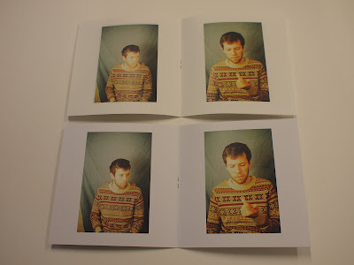
After the crit I looked into square booklets and tried different sizes, it was deemed that the middle and right booklets were too small and that the 14cm square booklets were the perfect handheld size but could still show the images at an appropriate size. Furthermore by making folded booklets it meant that I could show images side by side, although this went against my previous idea of showing each one separately I feel it does help in giving more of a feel for each person. It is also important to remember that each person has their own book and so I feel that they are personal enough in themselves.
Once I had decided on this I looked at paper types and narrowed it down to the two shown below, one was slightly thinner but with a much nicer texture (left) while the second was thicker and very glossy (right). Due to my own personal preference and the response of my peers it was deemed that the textured paper, though thinner, was more appropriate for the style of work I was presenting and the work that I normally do. Now I had made these decisions I could make the full collection of booklets and apply the sleeve to a square design.

Crit Responses

After showing the booklets I received little feedback on the actual photos and more on the design and presentation of them, it was deemed that the full bleed booklet was not appropriate as it made the images seem like adverts. Through the discussion we came to the conclusion that the photos needed to be framed within the booklets and that it was necessary to have white space around them. Furthermore the dimensions of the booklets were questioned and the idea of square books was put forward, this would allow for portrait and landscape images to be printed at the exact same size and just oriented differently.

In regards to the presentation the overall consensus was that people preferred the sleeve as opposed to the box, the only comments made were that it needed to be sturdier both to remain intact for the duration of the exhibition and so that it could stand alone as an object. This was is what I had hoped would be the situation and so I was rather pleased, however due to the possibility of square books I would have to redesign the sleeve in order to fit as a square as opposed to a rectangle.

In term of the final piece I had selected 4 images taken in the past few months that I felt were appropriate to the project, I saw the exhibition as a chance to showcase one piece of work that truly represented my practice and I felt that this should be a portrait. I had made an active decision not to just use one of the photos featured in my book and blow it up and as I felt although it had been a valuable project the pictures I had taken were somewhat forced and felt removed from the style of pictures that I prefer to take and would like to continue taking. In preparation for the crit I booked in to use the negative scanner and scanned each image at a very high resolution ready to be printed at any size up to A0. Below are the four images I presented.

Patrick - tram
This photo was taken in Gothenburg, Sweden, during a tram trip to the city centre. I feel that it shows Patrick in a fairly relaxed state and that the eye contact gives the photo a certain level of intimacy. Although the subject is fairly well light I feel that the overall photo is too cluttered due to the shapes and seats of the tram.

James - tram
This photo was also taken on a tram trip in Gothenburg, again it was taken much more casually than a lot of the photos in this project but I feel that it looks a little forced due to the pensive way he appears to be looking out of the window. Furthermore the sunlight, though visually appealing, bleaches out half of the subjects face resulting in a lakc of clarity.

James - airport
This photo was taken at the airport while waiting for our flight, at the time the subject was on the phone and looked up and seemed slightly surprised to see that I was taking his picture. Again I feel that this lead to a much more natural photo than a lot that I took during the process of this project. Furthermore feel that it is well light and composed and that the colour and focus in his eyes has resulted in a fairly intimate image.

Joe - Arthur's seat
This is the fourth and final image I presented in the crit, it was taken on New Year's day in Edinburgh. I feel that it shows the subject as a person interested in climbing and nature, presenting them as a very calm and considered person. However I also fee that it looks somewhat posed, despite the fact that it wasn't.

After showing the four images the one of James at the airport was the instant favourite, it was deemed that the two tram pictures were too cluttered or too bright and thus didn't work efficiently as portraits. Secondly it was decided that the photo of Joe was very nice visually but didn't really feel like a portrait. James' picture was deemed the most aesthetically pleasing but also the most intimate and so served the purpose as a portrait.

In conclusion I had come to the decision that I would look into square books and a more rigid sleeve and picked my final image, leaving only the framing and presentation of it left to be decided upon. I had suggested mounting it in a thin black frame or from bulldog clips and both of these were seen as inappropriate and it was said that due to it being a portrait it should be presented like it and thus in a more considered manor.

Presentation Testing

After coming to a conclusion on the booklet style I decided to focus on how to present them, with 12 sets of photos I needed a presentation method that could show all 12 booklets at once but also contain them. Firstly I made a design that would showcase each person and represent the idea of a collection and then set about how I would apply this to the packaging of the booklets.

Here you can see my initial design, a simple bow showing the eyes of each sitter separately but presented together. I focussed on the eyes as this is always thought to be a fundamental part of portraiture and thus vital in representing a person, on top of this I added very basic type to describe the project. My intentions were to keep the design as simple as possible, partially to in order to not distract from the images but also because I have a very limited knowledge of graphic design and layout.

Below are examples of my first idea, a sleeve that would simply slide over the booklets and contain them as a collection but was easily removable for viewing. This was a mock up and so produced on fairly flimsy card but was provided to give an overall impression of the sleeve and served only as an example.

My second presentation idea was an open box in which the books would sit with a cover sheet printed and laid on top. I was less interested in this idea from the start and felt that a box would be too fiddly and may get damaged or fall apart during the exhibition.
Although I had initially preferred the sleeve I decided to take both as examples to my final crit, this way I could get feedback on them and make an informed decision as opposed to deciding on my own.

Booklet Testing

After my initial booklets had been criticised for opening awkwardly or in a manor that affected the viewing of the images I set about testing various types of booklet, below you can see various sizes and styles that were tested before the final crit.

A4 Portrait - opening from bottom
This addressed one of the initial concerns of booklets opening from the top and thus the face being the last thing that the viewer saw, by opening from the bottom it meant that the face was the first thing the viewer engaged with. By being A4 it meant that the images were large and very accessible, however I came to the conclusion that they were in face too large and the thought of sifting through twelve booklets of this size would be an arduous task.

A4 Landscape - opening from side
This was another attempt at an A4 size book, again it was deemed to large and suffers all of the same criticisms of the previous design, however I feel that this style is very strong and definitely usable in the future but just not for this project. Another main criticism is that by making the book this size the images printed in the same dimension as the book are very large whereas those printed landscape in a portrait booklet must be significantly smaller.


A5 Portrait - various borders
After dismissing A4 as a size I decided to try something smaller in order to retain the quality but make something more holdable and accessible, this lead to various layouts for A5 booklets as shown below. Each booklet had a single image on each open page allowing the viewer to see each image separately and as single portraits. As you can see one has a significant white border, followed by a much smaller border and finally a book with no border and all images printed full bleed, this was well received within the confides of the studio and seemed to be the favourite when I asked for feedback among my peers.
The booklet with no borders, far right, had now become the most promising style yet, due to this I printed another copy on reasonable paper in preparation for the final crit.

Set 12 - Sam

This is the final person I took pictures of within the same house, I had been following a theme of photographing each person in their room and it had obviously become fairly limited however I think that Sam was also one of the easiest people to photograph this day due to his enthusiasm.

Most successful image
This shows the subjects desk and multiple sketchbooks and possessions but also his playfulness with the kissing expression, I also feel that the colour and composition are fairly good resulting in a strong image overall.

Least successful image
This image was taken in more of a snapshot nature in an attempt to capture the subject off guard, however by doing this I neglected some of the camera settings resulting in quite a dark photo, despite this I feel that it is still relatively well composed. Furthermore the facial expression, though natural, gives the picture a humorous but unprofessional tone and seems more like a snapshot or casual photo than a portrait.

More of these images can be seen in a small booklet and the rest will be contained on a memory stick upon hand in.

Set 11 - Rufus

The subject shown here is somebody that I know reasonably well but have never really photographed and I think this is slightly obvious in the photos, there is something very slightly awkward at first before things gradually became more relaxed and generally worked a lot better

Most successful image
I feel that this is a strong, and possibly one of the best, example of the improvement in my lighting technique, there are slight necessary shadows and enough white light without a yellow overtone. I also feel that the subject looks fairly relaxed due to the environment of their own room but is also holding quite a strong gaze, giving the picture another level if intimacy.

Least successful image
This was one of the first photos taken, it is poorly light but also quite boring in general. The subject seems to look uninterested and I generally feel that he may have been at this point.

More of these images can be seen in a small booklet and the rest will be contained on a memory stick upon hand in.

Set 10 - Alex

This selection of photos was taken around the subjects house, giving them the opportunity to play up to certain environments and do as they saw fit. Annoyingly the camera I normally use ran out of battery so I had to use a back up camera that I was less familiar with.

Most successful image
I feel this makes the subject look very relaxed and like they are having fun, although they are not making eye contact in the photo I still feel that there is a certain connection with the subject.

Least successful image
This photo was taken between shots while the subject was lay of the floor on their phone, it was taken in more of a snapshot manor which is normally how I prefer to shoot however this just looks really posed and just doesn't seem to work.

More of these images can be seen in a small booklet and the rest will be contained on a memory stick upon hand in.

Set 9 - Rosie

These were definitely amongst some of the hardest pictures that I have taken in this project so far, there were very few possible locations or scenarios and the subject was incredibly shy but I feel that I still benefitted from taking these pictures. I feel that this has added even more proof to my thoughts that both I find it easier to photograph boys and that boys prefer to be photographed.


Most successful image
As mentioned previously Rosie was one of the hardest to take pictures of, this was because of how shy she is, I feel that this picture captures and thus represents her. It is reasonably well composed and the lighting is good if not a little yellow.

Least successful image
This is a photo that I took multiple times but the one below shows very poor lighting due to the use of only one light and little to no compositional thought at all.

More of these images can be seen in a small booklet and the rest will be contained on a memory stick upon hand in.

Set 8 - Francesca

These pictures show only a small handful of locations but it is the items in them that I find more interesting. As i have found throughout this project girls have been the hardest to put in front of lights and a camera but I feel this was reasonably successful but still didn't quite go as well as I had hoped.
Most successful image
I feel this photo shows the subject thinking while obviously sat at their usual work place. In some respects the photo is cluttered but I think that all the things within this photo add to the viewers perception of the person in it.

Least successful photo
There are many reasons for this photo being unsuccessful, I feel that the location, composition and lighting are all very poor resulting in a very dim and boring image.

More of these images can be seen in a small booklet and the rest will be contained on a memory stick upon hand in.

Film Vs Digital

Up until this point I had been shooting all my photos on film using a Contax G2 rangefinder and keeping my Olympus Pen digital camera in my camera bag as a back up camera, however the batteries ran out in the G2 during the following set of photos, because this the reaming photos for the project were shit digitally. I had been using film originally as I am more comfortable with it and the cameras I use it in, furthermore it is just a personal preference and the medium I would pick whenever given the choice. Despite this I found that using my digital camera was relatively straightforward and easy to use once I had overcome some software issues. In my opinion the last 3 sets of photos are somewhat lifeless in comparison and fairly boring in some respects but obviously the turn around on getting the photos back was instant, my biggest observation was that I checked almost every image as I took it to check it was okay, purely because I could and I wasn't sure if they would be. However as I have become so comfortable with film I don't feel the need to check each image and trust myself to envision what photos I have taken, regardless of this I feel that I learned a lot and using digital more often is something I will have to get used to as many clients will be likely to prefer it.

Final Piece

During the recent crit I was asked what I had wanted to put up in the exhibition, being told that it was my chance to exhibit any piece of my own work to an audience and so to pick something that I feel represents my practice and is of a good quality. My initial response was that it should be a portrait and ideally an image that shows my technical skills. I looked back to some photos I took at the end of last year in Sweden and found a few that I feel are strong portraits but also show the visual style that I am developing that I feel is overall different from the style of pictures I have taken in this project which I feel are somewhat forced.
Other examples I have are taken from a New Years trip to Edinburgh, they were taken fairly casually throughout the trip and in the much more natural way that I tend to take photos and again I feel that I have captured the subjects as they were in a much more comfortable environment.
Below are the 5 images that I will present at the final crit to discuss about using, my intentions are to scan all of these files at a high resolution before then so I can go about printing them as soon as possible once I have decided. I feel that the images of James and Patrick could be shown as a pair but this is debatable, furthermore the overall presentation and framing of my images is not something I've yet thought about.
I feel at this point that I should mention that the photo of Joe at Arthur's seat on New Year's Day is my personal favourite, partially as I feel that it has achieved what I have wanted to throughout this project and captured the person as they were at the time but also as I feel that aesthetically it is one of the strongest images.

James - Sweden


Patrick - Sweden

Simon - Edinburgh

Callum - Edinburgh

Joe - Edinburgh